 Don’t delay book a free digital chat today

Responsive web design has been around for a while but now it’s more important than ever. The ‘mobile first’ notion has become a reality with smartphones taking the lead ahead of desktop computers, laptops, and tablets. Google prioritises and rewards websites with up to date responsive websites as they cater to all devices. Now people even rely on their smartphones for entertainment over their televisions, search is becoming more common from mobile devices, along with ecommerce.
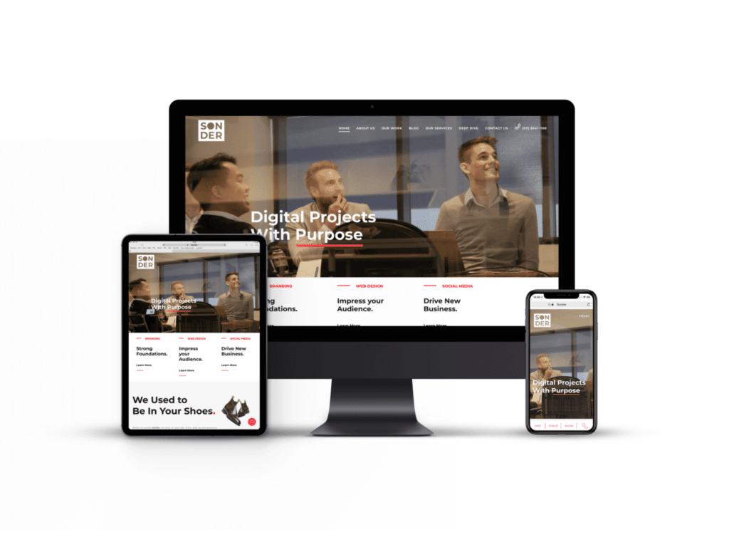
Responsive web design is where a designer creates a website that will resize or ‘respond’ to different devices, adjusting its size, design, and layout to the device. Responsive design travels from laptops to tablets to large desktop computers and to smartphones. Responsive websites use fluid grids so they recognise the device and automatically adjust and shift to the device. The sizes, shapes and images aren’t the only considerations.
Responsive web design is considering how website’s assets can change from device to device. A button might be easy to click or select with a mouse on a desktop computer but it could be more tricky using your thumb on a smartphone. There are a lot of small but important considerations that make a website truly responsive. You can read about a few of these aspects here.
The term ‘responsive design’ was coined in the early 2010s, but the first website to feature responsive web design was actually Audi’s back in late 2001. It was partially responsive and would resize according to the size of the user’s browser. A year later, in 2002, the first ‘smartphone’ was released: the Blackberry. It wasn’t until 2006 that smartphones began to be marketed in the United States as devices for entertainment rather than business. The iPad then came in 2010 but the year of responsive web design didn’t come around for another three years, in 2013.

Prior to 2013 we had ‘adaptive websites’. Remember internet browsing on your phone? Finding the link to their mobile website? Rather than sonder dot com dot au the URL would appear as m dot sonder dot com dot au. Mobile responsiveness has slowly but surely been gaining in popularity but 2015 was a game changer in the industry. Google announced it would be rewarding newer and better mobile responsive websites — meaning they’d now rank higher. Each year, more and more statistics come out that further cement the fact that responsive design is here to stay.
The difference between adaptive web design and responsive web design? Responsive web design is one layout that always changes to the device. Using a fluid grid, the website changes in size and layout appropriately to the device. Whereas adaptive web design is many different layouts for multiple screen sizes. The website needs to detect which device the user is using and delivers or displays the appropriate layout for that device.
Adaptive websites are cheaper initially but become more expensive as you progress with them. If you have two mobile, two laptops, one desktop, and one tablet layout on an adaptive website, you have six different layouts. That means you essentially have six websites to maintain and update. A responsive website is all in one and so it’s still just one layout and one website to maintain.
Does responsive design mean the same thing as mobile friendly? Kind of. Responsive design means the design responds to the user’s device. More often than not, the device is a smartphone. While there’s a huge focus on designing for smaller screens, there’s only minimal consideration for larger screens. Referring to larger screens we mean large desktop screens. Like iMacs or large Dell desktop computers — screens measuring in at 20 inches or more.
The background image often has a fixed width and will leave gaps on either side when displayed on a screen with a larger resolution. Problems come up with font size, it can be difficult to read as it’s too small for the size of the screen or the columns of the text can be wider than is ideal and make it difficult to read.
The other issue web designers have run into in the past when they’ve been designing for these bigger screens is treating desktops the same as televisions. TVs are a similar shape and size but they’re used pretty differently. Desktop computers are used sitting up close, normally the user is actively reading, working, or browsing. Whereas televisions are used from a distance, there’s minimal reading, the resolution is different. But as we’ve progressed in web design, the practices have become much more clear.
Responsive web design is obviously more pleasant for the user. With adaptive web design there are more limits on screen dimensions but responsive web design eliminates those. Responsive designs come with a guarantee that they’ll work on any sized screen, where as their adaptive counterparts are limited to the layouts available to them.
A key benefit of responsive web design is the User Experience and User Interface. These designs provide extra assurance that the user will have a pleasant experience and the design will look good. Meaning website traffic should spend longer on the page and your website should perform better.
It comes under User Experience, but responsive websites have significantly better load times. Adaptive websites need to load every possible layout they have while a responsive website only loads that one layout that is able to work across all devices or platforms.
On top of all of that, responsive websites rule SEO. Obviously, having one URL is healthier for your website’s SEO, but Google also prioritises and favours responsive web design. Responsive websites rank higher on Google and perform better generally.
Responsive sites won’t need to be updated in future years because they aren’t limited to those layouts like an adaptive site. So a responsive site will look good on the next generation phones, tablets, and computers — no matter their screen dimensions.


