Email signatures: they’re worth more than just making sure your email doesn’t look bland or spammy. Your email signature can make or break your professional image, give credibility to your emails, and help you differentiate yourself from your competitors or other service providers.
There’s plenty of super practical benefits to a good email signature too. Having all your contact details neatly presented gives your clients, colleagues, and whoever you email an easy way to get in touch — without the awkward “sorry what was your number” email prior to a call. It can get you more social media follows and more website traffic. Aaaand, it can even call a client or prospect to action (to buy).
Obviously, a good email signature is simplistic and professional — but that doesn’t mean it needs to look like every. other. email signature.
Here’s how to nail your email signature design — with examples!
How to Design a Great Email Signature
Your email signature is important! Like David Pagotto from SIXGUN says, “Not only does it provide all of the relevant contact information, it is also one of the first assets that is viewed by a potential customer and sets up your level of professionalism immediately.”
1. Keep it all Simple
A simple design rule and one that applies to your email signature as well, is to keep it all simple. Less is more, especially if you want those few, essential elements in your email signature to hold the right weight. Keeping your email signature simple means:
- Only including key contact information
- Choosing your 3-4 key social media links
- Not overloading your signature
So, don’t include all of your awards. Don’t include a bio. Don’t make it long or bulky. It should be simple, short, and to the point.
Consistent Colours
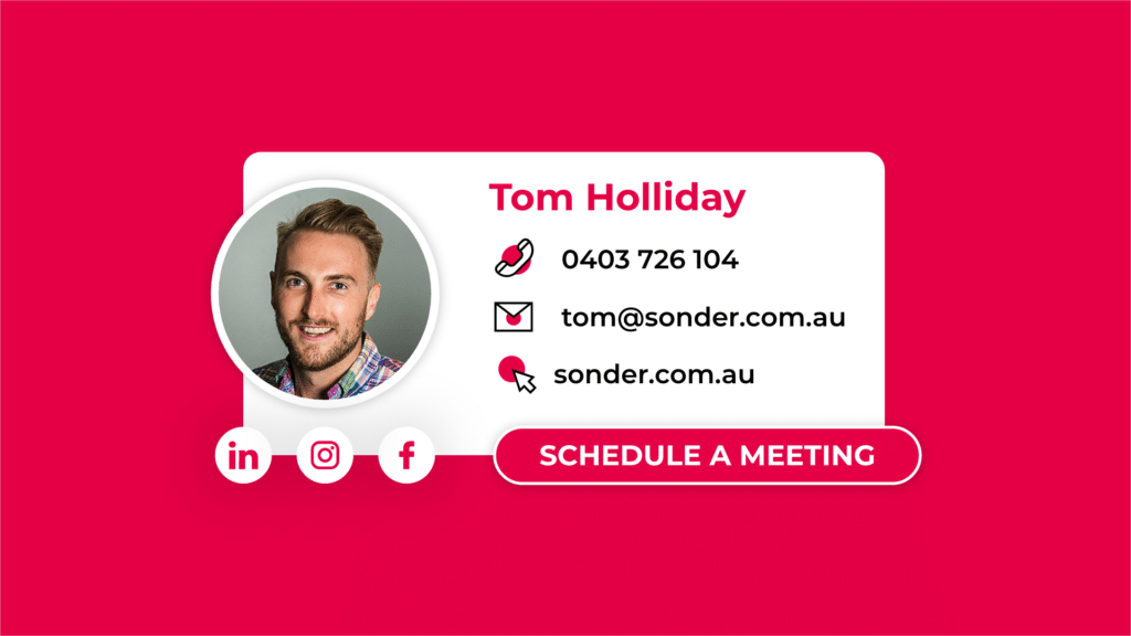
Just like your business’ brand, your email signature should only use those few key brand colours. At Sonder, our email signatures use our three brand colours: the Sonder red, a white, and a black. Limit the amount of colours you use and keep them seeming intentional and of course, complementary to each other.
Don’t overload on the text
Your email signature doesn’t need a bio. Honestly, it barely needs words. Aside from your name, your brand name, and a simple (few word) CTA, there’s no need for any other words.
2. Make it Obvious
The key to a quality design and a design that works with your goals, is to make super obvious. This kind of builds on that idea of keeping everything as simple as possible. Your email signature shouldn’t look like a big graphic that’s been pasted at the bottom of your email. It should be super obviously an email signature.
Paula Glynn from Pixel Storm says a good email signature is important because even if the recipient knows you, you still want to hold value, should it be forwarded on.
“Great Email signatures show a level of authority and skill. If you offer premium design you are expected to have a sleek email signature. If you are a thought leader you might have a photo or something that connects you visually as a person to a brand,” said Glynn.
Include your Headshot
This point is pretty simple. Including your headshot makes your email more personable. It helps the people you’re communicating with to put a face to your name, it humanises your email, and it makes everything more credible. Plus, the simplistic imagery of your headshot can add just the right amount of ~pzazz~ to your email signature.
Only use the Relevant Contact Information
Does anyone need to see your physical address in your email signature? Probably not. Keep it to your phone number, email address, and website link. This is everything they need. Then, you can build on this by adding in small social media icons they can click through to.
Keeping it simple and obvious means that your email signature will be way more practical and helpful to clients or prospects. It means it’s way easier to absorb and navigate. Never ever forget, people are way too lazy to have to search for a detail.
Authority Hacker’s Mark Webster builds on this, saying, “One key thing I would advise anyone looking at creating a signature is to be very careful about the number of links it contains.”
“There have been many studies correlating the fact that including too many links in your email can lead to increased bounce rates and so listing off every social media account, your personal website, company website, and so on could quickly add up. Instead, consider simply including the handle of your social accounts instead of the actual link.”
3. Include a Simple CTA
Whether you’re sending out newsletters, company updates, or just regular correspondence, a CTA can never ever hurt. Having a simple button in your email signature so that those on the receiving end of your emails can easily get in touch or book a meeting, means you’ll be actively supporting your marketing and sales efforts.
We love Calendly
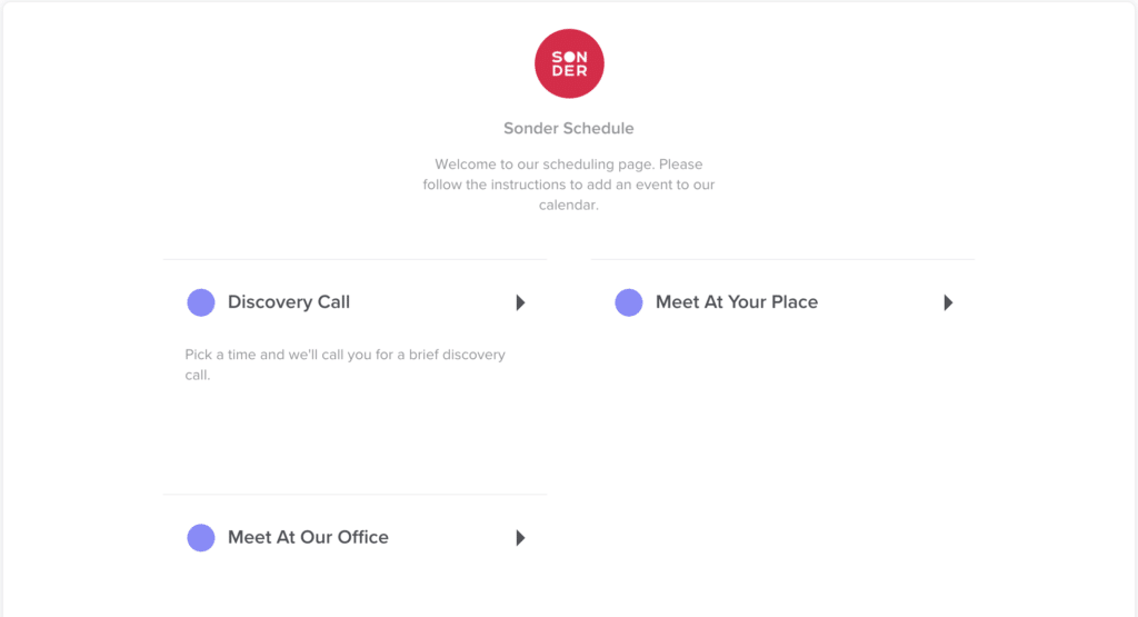
At Sonder, we use Calendly so our clients can book meetings on their terms super easily. It integrates with our calendars — so there’s no worries about double ups or anything. Basically, you just share a link to your business’ or your personal Calendly and your prospective clients can go ahead and book themselves in to meet with you.
We have a simple “Schedule a Meeting” CTA in our email signatures.

Clicking the button takes them to our Calendly where they can quickly schedule the meeting. Easy peasy squeezy.

4. Animation looks fancy AF, but it needs to be good
Animating your email signature is a cool idea. The thing is that it needs to be good. A well-designed, stagnant email signature will always look way better, way cooler, and more impressive than an animated email signature that’s broken.
So, if you’re going to animate your email signature, make sure it works. Make sure your email still loads quickly and well. And make sure it works without the animation. What we mean by that is: if the animation doesn’t load or isn’t supported by the receiver’s email provider, will your email signature work stagnantly? This is important.
Be sure to note that a bunch of GIFs and general email HTML isn’t supported in Outlook inboxes, as one example.
5. Make sure it works across devices
Like all things design, responsiveness is key. Make sure your email signature works across all devices. Especially if your email signature is slightly outside of the typical sig — try it out across different devices: a desktop computer, a tablet, a phone, and a laptop.
Some email signatures we really like
You might’ve stumbled across this blog because you actually really wanted to read 1,000 words on email signature design. But, the more likely scenario is that you’re here for inspo. So, here you go — here are some of our favourite email signatures.
Us 😉
Imagine if we, a digital marketing agency with a strong focus on design, didn’t show off our own great email signature first.

Bad Everything
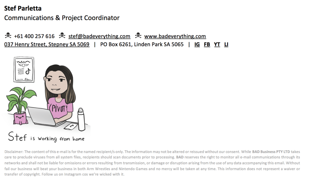
One of Bad Everything’s content developers was missing the team after they’d all started working from home. He decided to make up personalised email signatures that reflected the team’s WFH spaces and personalities. We thought this idea was super cute!
“I’ve got my houseplant and TikTok open on my phone, one of our designers has her messy desk and coffee cups, my boss has a couple cans of Mismatch. He did a great job, mine is very accurate to what my WFH set up looks like!” said Bad Everything’s Stef Parletta.

ShareStory
Our pals at ShareStory have gone for a simple but classic look here (email signature or fashun – you decide).

Spot.
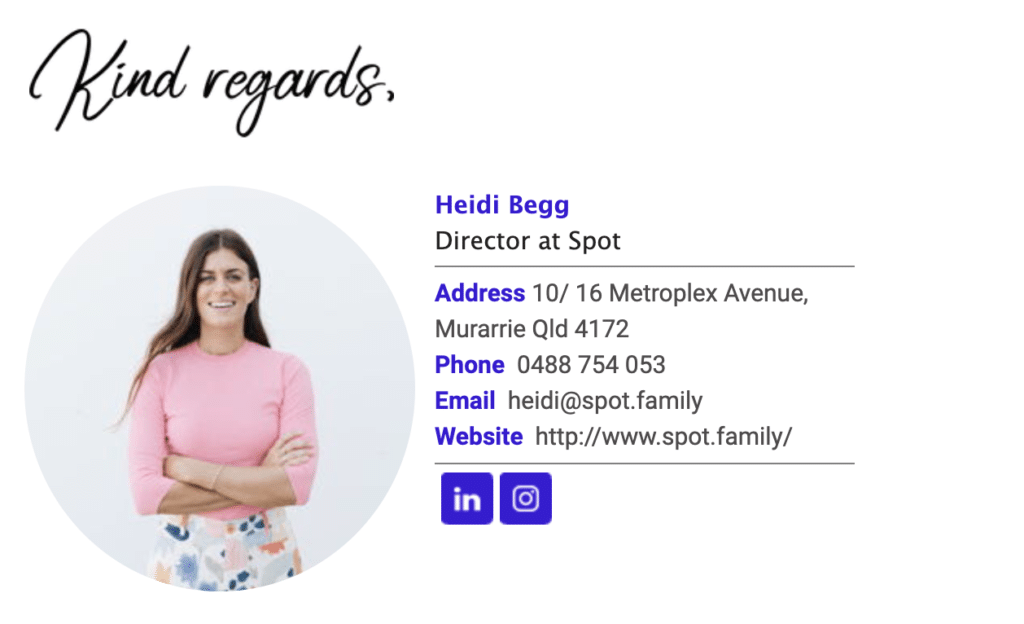
This is our client, Spot’s Director’s email signature. It uses just one of Spot’s brand colours as well as their circle (spot) brand element while displaying Heidi’s headshot. Super simple but clever.


 Don’t delay book a free digital chat today